728x90
반응형
ListView 사용법과 주요 property
- 가장 일반적으로 사용되는 스크롤 위젯
- ListView는 주로 다음과 같은 방식으로 사용
- 일반적인 ListView를 명시적으로 호출하고 children 전달하는 방법 (적은 데이터에 사용시 용이함)
- ListView.builder를 사용하여 동적으로 호출
- ListView.separated는 ListView.builder 기능에 구분선 사용 가능
- 주요 property
- reverse: true이면 bottom에서부터 리스트 표시
- padding: 리스트 아이템 간격 (EdgeInsets로 적용)
- itemCount: 동적 리스트 아이템 개수 (ListView.builder/ListView.separated에서 사용 가능)
- itemBuilder: 각 동적 리스트 아이템 정의 (ListView.builder/ListView.separated에서 사용 가능)
- physics: 스크롤 방식 설정
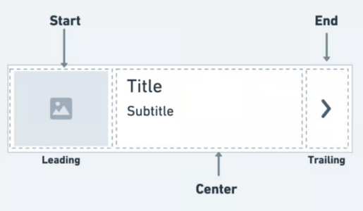
리스트 타일 위젯을 사용
import 'package:flutter/material.dart';

// ListView와 ListTile 위젯을 살펴보자
void main() {
  runApp(MyApp());
}

class MyApp extends StatelessWidget {
  MyApp({super.key});

  @override
  Widget build(BuildContext context) {
    return MaterialApp(
        debugShowCheckedModeBanner: false,
        home: Scaffold(
          body: ListView(
            children: [
              ListTile(
                leading: CircleAvatar(
                  backgroundColor: Colors.amber,
                  child: Text(
                    '1',
                    style: TextStyle(fontWeight: FontWeight.bold, fontSize: 20),
                  ),
                ),
                title: Text(
                  'item1',
                  style: TextStyle(color: Colors.black),
                ),
                subtitle: Text('item sub....'),
                trailing: IconButton(
                    onPressed: () => {print('버튼 눌렀다.')},
                    icon: Icon(Icons.more_horiz)),
              ),
              ListTile(
                leading: CircleAvatar(
                  backgroundColor: Colors.amber,
                  child: Text(
                    '1',
                    style: TextStyle(fontWeight: FontWeight.bold, fontSize: 20),
                  ),
                ),
                title: Text(
                  'item1',
                  style: TextStyle(color: Colors.black),
                ),
                subtitle: Text('item sub....'),
                trailing: IconButton(
                    onPressed: () => {print('버튼 눌렀다.')},
                    icon: Icon(Icons.more_horiz)),
              )
            ],
          ),
        ));
  }
}
list-2
import 'package:flutter/material.dart';

// ListView와 ListTile 위젯을 살펴보자
void main() {
  runApp(MyApp());
}

class MyApp extends StatelessWidget {
  MyApp({super.key});

  @override
  Widget build(BuildContext context) {
    return MaterialApp(
        debugShowCheckedModeBanner: false,
        home: Scaffold(
          body: ListView.builder(
            itemCount: 20,
            itemBuilder: (context, index) {
              return ListTile(
                leading: CircleAvatar(
                  backgroundColor: Colors.amber,
                  child: Text('${index + 1}'),
                ),
                title: Text('Item ${index + 1}'),
                subtitle: Text('Item sub ${index + 1}'),
                trailing: IconButton(
                    onPressed: () {
                      print('${index + 1} 버튼 눌렀다.');
                    },
                    icon: Icon(Icons.more_horiz)),
              );
            },
          ),
        ));
  }
}
GridView 위젯
- 리스트 뷰와 마찬가지로 항목을 나열하는 위젯이지만, 리스트 뷰와 달리 한 줄에 여러 개를 함께 나열할 수 있음 (그리드 형태)
- 리스트 뷰와 마찬가지로 그리드뷰도 GridView.builder() 생성자를 제공하며,
- itemCount, itemBuilder 속성을 통해 항목의 개수와 위젯을 지정
- gridDelegate 속성을 설정해야 함
- 이 속성에는 SliverGridDelegateWithFixedCrossAxisCount 객체를 지정해줘야 함
- 해당 객체에서 crossAxisCount 값이 한 줄에 함께 나와야 하는 항목의 개수임
- 그리드 두 방향을 설정하지 않으면, crossAxisCount는 가로를 가리킴
- 참고: scrollDirection 속성에 Axis.horizontal을 설정하면, crossAxisCount는 세로 방향을 가리킴
그리드 뷰 연습
import 'package:flutter/material.dart';

// ListView와 ListTile 위젯을 살펴보자
void main() {
  runApp(MyApp());
}

class PocketMon {
  final String imagename;
  final String name;
  final int power;

  PocketMon(this.imagename, this.name, this.power);
}

class MyApp extends StatelessWidget {
  final List<PocketMon> pocketmons = [
    PocketMon('메타몽.jpg', '메타몽', 10),
    PocketMon('뮤츠.jpg', '뮤츠', 100),
    PocketMon('잠만보.jpg', '잠만보', 1),
    PocketMon('파이리.png', '파이리', 80),
    PocketMon('메타몽.jpg', '메타몽', 10),
    PocketMon('뮤츠.jpg', '뮤츠', 100),
    PocketMon('잠만보.jpg', '잠만보', 1),
    PocketMon('파이리.png', '파이리', 80),
    PocketMon('메타몽.jpg', '메타몽', 10),
    PocketMon('뮤츠.jpg', '뮤츠', 100),
    PocketMon('잠만보.jpg', '잠만보', 1),
    PocketMon('파이리.png', '파이리', 80),
    PocketMon('메타몽.jpg', '메타몽', 10),
    PocketMon('뮤츠.jpg', '뮤츠', 100),
    PocketMon('잠만보.jpg', '잠만보', 1),
    PocketMon('파이리.png', '파이리', 80),
    PocketMon('메타몽.jpg', '메타몽', 10),
    PocketMon('뮤츠.jpg', '뮤츠', 100),
    PocketMon('잠만보.jpg', '잠만보', 1),
    PocketMon('파이리.png', '파이리', 80),
    PocketMon('메타몽.jpg', '메타몽', 10),
    PocketMon('뮤츠.jpg', '뮤츠', 100),
    PocketMon('잠만보.jpg', '잠만보', 1),
    PocketMon('파이리.png', '파이리', 80),
  ];

  MyApp({super.key});

  @override
  Widget build(BuildContext context) {
    return MaterialApp(
      debugShowCheckedModeBanner: false,
      home: Scaffold(
        body: GridView.builder(
          scrollDirection: Axis.vertical,
          gridDelegate: SliverGridDelegateWithFixedCrossAxisCount(
            crossAxisCount: 3,
            crossAxisSpacing: 10.0,
            mainAxisSpacing: 10.0,
            childAspectRatio: 2 / 3,
          ),
          itemBuilder: (context, index) {
            return _innerContainer(
              pocketmons[index].imagename,
              pocketmons[index].name,
              pocketmons[index].power,
            );
          },
          itemCount: 20,
        ),
      ),
    );
  }

  Widget _innerContainer(String name, String text, int power) {
    return LayoutBuilder(
      builder: (context, constraints) {
        double parentWidth = constraints.maxWidth;
        return Container(
          decoration: BoxDecoration(
              color: Colors.white,
              border: Border.all(
                color: Colors.amber,
                width: 4,
              )),
          child: Center(
              child: Column(
            mainAxisAlignment: MainAxisAlignment.spaceBetween,
            children: [
              Image.asset(
                width: 150,
                height: 180,
                'assets/images/${name}',
                fit: BoxFit.contain,
              ),
              SizedBox(
                height: 20,
              ),
              _builderNameContainer(text, power, parentWidth),
              // Text(
              //   ' ${text}',
              //   style: TextStyle(fontWeight: FontWeight.bold, fontSize: 15),
              // ),
              // Text('Power : ${power}'),
            ],
          )),
        );
      },
    );
  }

  Widget _builderNameContainer(String text, int power, double parentWidth) {
    return Container(
      width: parentWidth,
      color: Colors.amber,
      child: Column(children: [
        Text(
          ' ${text}',
          style: TextStyle(fontWeight: FontWeight.bold, fontSize: 15),
        ),
        Text('Power : ${power}'),
      ]),
    );
  }
}
PageView 위젯
- 스와이프 이벤트에 반응하여 항목을 보여주는 위젯
- PageController의 initialPage로 처음 보일 페이지를 설정할 수 있고, viewportFraction으로 현재 페이지가 화면에 차지하는 비율도 설정 가능
- 예: viewportFraction: 0.7이면 현재 페이지가 화면에 70%, 나머지 30%가 이전과 다음 페이지가 살짝 보이게 됨
- PageController 객체를 PageView의 controller 속성에 적용하여, PageController 설정을 반영시킬 수 있음
import 'package:flutter/material.dart';

void main() {
  runApp(MyApp());
}

class MyApp extends StatelessWidget {
  MyApp({super.key});

  @override
  Widget build(BuildContext context) {
    return MaterialApp(
      debugShowCheckedModeBanner: false,
      home: SafeArea(
        child: Scaffold(
          appBar: AppBar(
            backgroundColor: Colors.white,
            elevation: 1.0,
            title: Text('Page View'),
          ),
          body: PageView(
            controller: PageController(
              initialPage: 2,
              viewportFraction: 0.5,
            ),
            children: [
              Container(
                margin: EdgeInsets.all(0.0),
                color: Colors.red,
              ),
              Container(
                margin: EdgeInsets.all(0.0),
                color: Colors.lime,
              ),
              Container(
                margin: EdgeInsets.all(0.0),
                color: Colors.deepPurpleAccent,
              )
            ],
          ),
        ),
      ),
    );
  }
}
728x90
반응형
'Frontend > Flutter' 카테고리의 다른 글
| [flutter19] LoginApp 만들기 (0) | 2025.01.13 |
|---|---|
| [Flutter00]플러터 기본기 다지기2 (1) | 2025.01.08 |
| [Flutter00] 플러터의 기본개념 다지기1 (0) | 2025.01.08 |


댓글